Turning Your Vision Into Measurable Growth and Brand Clarity
Creative & Brand Director trusted by startups, growth-stage ventures, and industry leaders.
“A creative genius”
– Huffington Post

You want to grow your brand and connect with your audience. I bring design, strategy, and storytelling together to make that happen.
For 20+ years, I’ve led creative and digital teams through rebrands, product launches, and marketing overhauls that drive results. My focus is always the same: turn big ideas into aligned execution.
Along the way, I’ve helped launch a venture-backed AI startup, shaped global brand platforms, led digital strategy at a top university, and written The Visual Marketer (Tilt Publishing, 2025) to help marketers design smarter. I also share weekly insights on AI, design, and marketing through my newsletter, Marketing by Design.
What drives it all? A belief that the best ideas deserve to be clearly seen and smartly delivered.
Collaborators and Friends
I’ve worked with some great brands over the years.


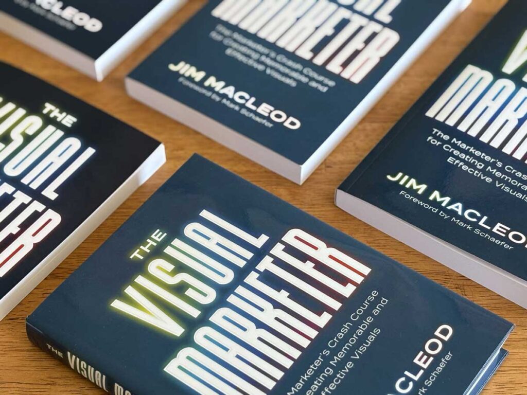
Create visuals you’re proud of, even without a designer
For marketers and business owners who have to make their own visuals but don’t have a design background, I wrote a book for you.
This book is not for designers, it’s for marketers. This book is an excellent resource … to break down what works, what didn’t, and why.
Joe Pulizzi, Bestselling author of Content Inc. and Epic Content Marketing
I wouldn’t hire a marketer without making this required reading. He does a great job at connecting marketing knowledge with the visual aspects we need to understand to market effectively.
A. Lee Judge
Founder, Content Monsta

It’s a great read. I’m Halfway through but has changed the way I look at my one pagers and pitch decks already!
Tyler Stambaugh
Co-founder, Magnetiq

It’s enough information to be insanely helpful but you don’t drown people in theory they’ll never get through/apply. Highly recommend.
Bill Schick
Agency founder, FCMO
This is just breathtaking in its usefulness. This book is almost encyclopedic in its scope. Highly recommended, and I don’t do that a lot.
Mark Schaefer
Keynote speaker, marketing strategist, bestselling author


Where Do You Need Help?
There are a lot of things I do well. I’m built to help marketing teams like yours who are looking to establish their brand and run measurable marketing activities.

Brand Strategy & Positioning
From revitalizing legacy logos to crafting new identities, I create distinctive visuals that capture a brand’s true character in an instant.

Visual Identity & Design Systems
Build a flexible toolkit of logos, colors, and guidelines that keeps your brand consistent at any size or speed.
Messaging & Storytelling
Shape narratives that speak your audience’s language and turn brand facts into memorable, shareable stories.

Creative Direction & Multichannel Content
Guide ideas from concept to launch across print, digital, and video so campaigns feel cohesive wherever they land.
Website / UX & Digital Experience Optimization
Transform web experiences into smooth, goal-oriented journeys that load fast, look sharp, and convert.

Integrated Campaign Development
Plan, execute, and measure multi-channel demand and brand campaigns that align marketing spend with real pipeline growth.

Conversion Optimization & Performance Analytics
Test, tweak, and track every element to lift engagement and prove the creative work is paying off.

MarTech & AI-Enabled Automation
Unify tools and data – layering smart automation – so your marketing engine runs leaner and learns faster.

Fractional Creative / Brand Leadership & Team Coaching
Step in as an on-demand leader to level up processes, mentor talent, and drive projects without the full-time overhead.

AI’s Impact on Marketing and Design is Undeniable
I’m a big fan of AI, so I’m learning everything I can and sharing it with you each week. Join more than 1,000 designers and marketers who are staying on top of the latest news and trends.
Let’s Chat
How can we work together to do amplify your brand?